
A chart on a page turns the entries your team has logged into a picture you can read quickly — a trend line, a row of bars, a split ring — instead of a table you have to scan line by line. Charts sit on dashboard pages, placed onto tabs as widgets beside tables, metric tiles and forms. Each one draws on the entries behind it, so the shape you see follows what has been logged.
Chart types you will meet
One page usually carries several charts, each shaped for the question it answers. A handful of forms come up again and again:
- Bar charts set a figure side by side across categories, so the longest bar is the biggest. A ranking of issue types, or of the people who logged the most work, reads this way.
- Trend charts plot a count along a timeline, one point per date, so you can watch it climb or fall across weeks and months.
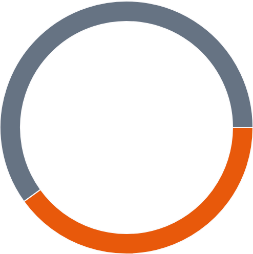
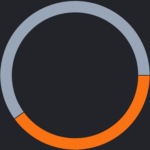
- Donut and pie charts split a single total into slices, each slice one category's share of the whole. The legend beside the ring lists every slice with its own figure.
- Grids that cross two things shade a cell for each pairing — hour of day against weekday, say — with darker cells standing for larger numbers, so clusters of activity stand out.
- Count tables lay the same crossed figures out as a small matrix, a number in each cell for one pairing of two categories.
Alongside the charts you will often see single-figure tiles — one headline number such as an average response time or a compliance percentage. Those are metric tiles rather than charts; the full set of shapes a page can hold is covered in dashboard widgets.
Hovering for detail
A chart is meant to be read quickly, so it shows the shape first and keeps the precise numbers out of the way. To read an exact figure, point at the part you care about: move your pointer over a bar, a slice, a point on a line or a cell in a grid, and a small tooltip appears with that item's label and its value. On a touch screen, tap the part you want to read.
You do not always need the tooltip. A donut chart lists each slice with its figure right there in the legend, and bar and trend charts carry a scale along one edge — running from zero up to the largest value — so you can size things up before you point at anything. The tooltip is there for the exact number behind a single bar, slice or point.
A chart is a summary, not the source. When you need the entries behind a figure — who logged what, and when — open the Entries screen, where the same data is listed in full.