
Your organisation's dashboard gathers the figures that matter — open issues, response times, how activity is trending — onto one screen, and keeps them in step with the entries behind them. Read it top to bottom: the headline numbers first, then the charts and the table of recent entries that explain them.
Opening the dashboard
The dashboard your whole team shares is one screen for the whole organisation. You reach it from the app's main navigation, alongside your directory and entries, and it opens on the Overview tab.
A row of tabs sits across the top. Overview counts the whole organisation, and each tab beside it narrows the same widgets to a single site or area — the widgets stay the same, but the entries behind them change. See Per-site dashboard tabs.
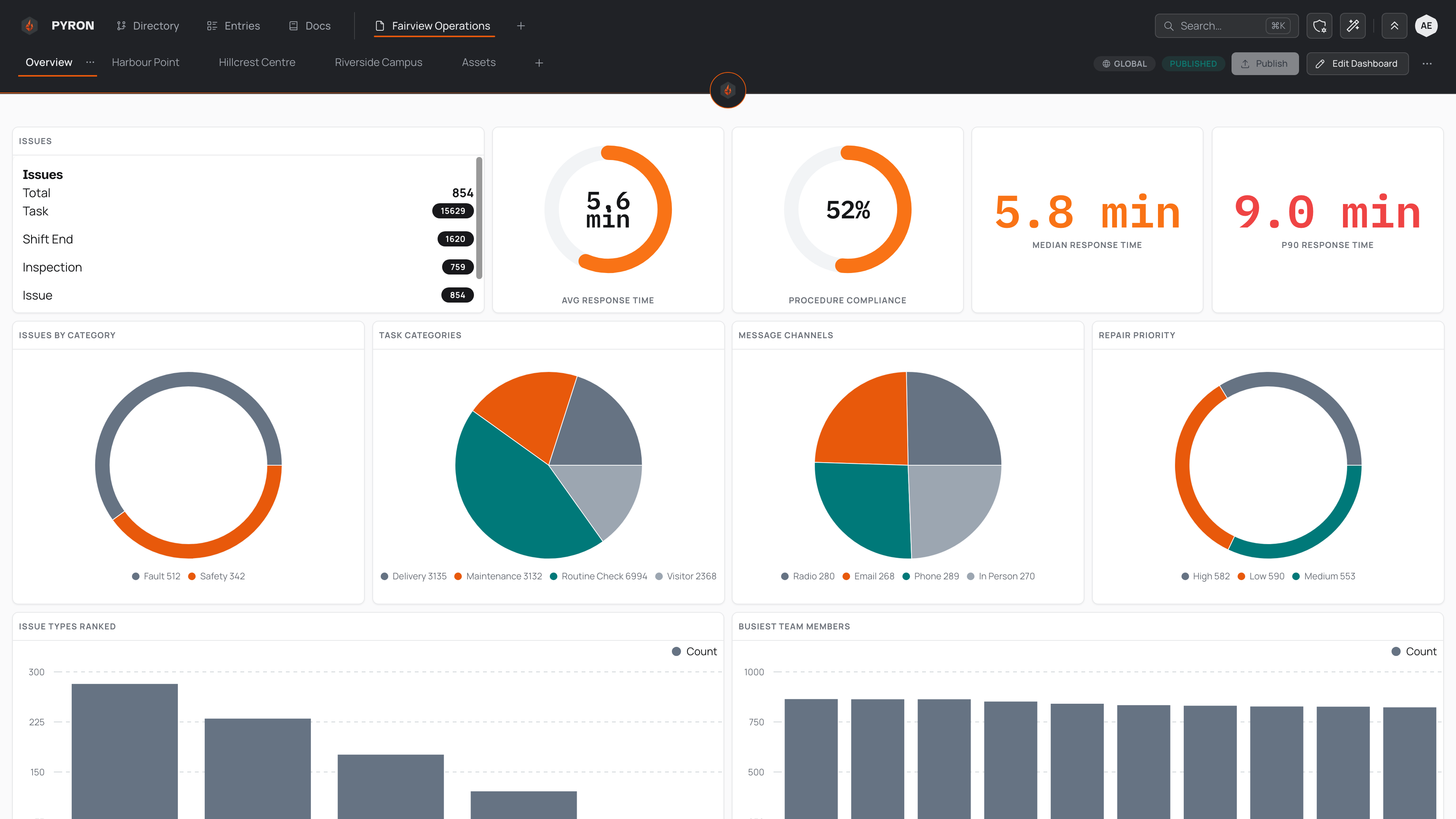
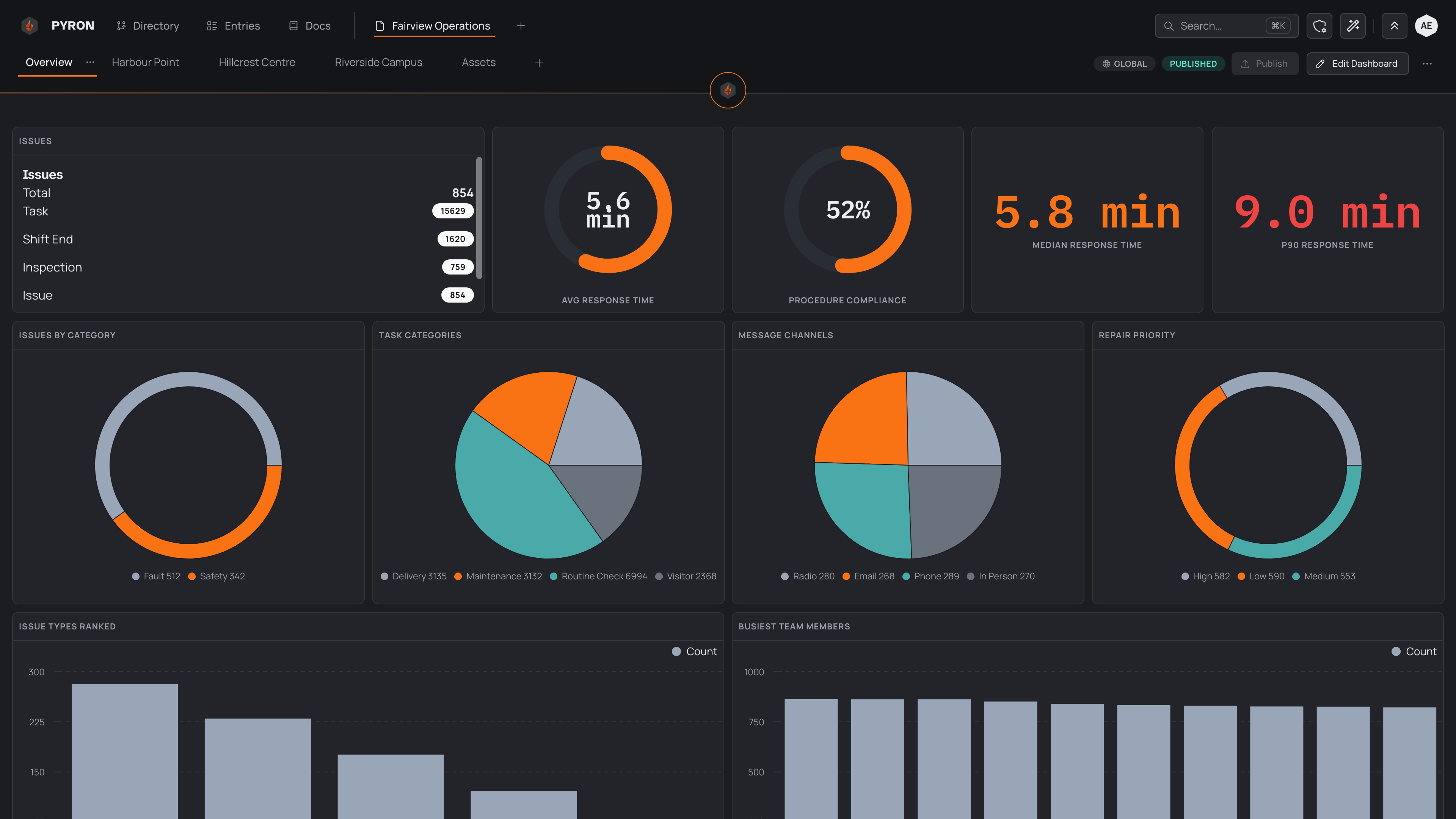
There is nothing to set up or refresh. Every widget reads live from your entries, so opening the dashboard shows the state of your information as it stands, not a figure saved earlier. For the idea behind dashboards, see Dashboards.
People who build the dashboard also see an Edit Dashboard control and can Publish their changes; reading it needs neither. If you want to compose or change one, see Adding and editing widgets.
KPIs at the top
The top of the dashboard is a band of KPIs — key performance indicators. Each one is a single number that sums up a whole area of the organisation, with a short caption naming what it measures. Reading these first gives you the headline before you look at any detail.
A KPI can be a count, an average, a percentage, or a percentile, depending on what it tracks. The Fairview Operations dashboard shows a MEDIAN RESPONSE TIME in minutes, a slower 90th-percentile response time, and a PROCEDURE COMPLIANCE rate as a percentage. Each number is worked out from your entries, so it moves as your team logs more.
Charts and tables below
Below the KPIs, the dashboard fills out with charts and a table. Where a KPI gives you one number, a chart turns many entries into a shape you can read — a trend, a breakdown, a ranking — and the table lists the entries themselves so you can open any single one.
The charts answer different questions:
- Charts over time, such as ISSUES OVER TIME and ALL ACTIVITY OVER TIME, plot counts week by week, so you can see whether things are climbing or settling.
- Breakdowns, such as ISSUES BY CATEGORY and REPAIR PRIORITY, split a total into its parts.
- Rankings, such as ISSUE TYPES RANKED and BUSIEST TEAM MEMBERS, order the biggest contributors first.
- A grid such as ISSUES BY HOUR X WEEKDAY shades each hour-and-day cell by how busy it was, so the busy stretches stand out.
At the foot of the dashboard, RECENT ENTRIES is a table of the latest entries, one per row, with columns for who logged each one, its TYPE, when the event happened, and any NOTES. You can search it, narrow it with Filter, choose which columns show, and Export what you see. It behaves like the table on the Entries page — see Table widgets for the full set of controls, and Viewing entries for opening a single entry from a row.
Every chart and table follows the same access rules as the KPIs, and each reads live — so the whole screen keeps pace as entries are logged, edited, and closed. To chase a figure back to the entries behind it, open the Entries page or narrow the recent-entries table to what you are after. See Filtering entries.